
Brand logos are more than just a symbol, it is a visual representations of a brand’s identity, values, and mission.
Some brand logos have become iconic and instantly recognizable, exceeding their role as mere design elements.
Here are the stories behind the top trending brand logos, along with the meanings they convey:
Apple

Crafted by Rob Janoff in 1977, the logo has become representation of cutting-edge technology and a sleek user experience.
Cost:
The cost of creating the Apple brand logo is estimates to be around $1.9 million. Additionally, the logo’s creation involved in-depth research and design iterations, ensuring it resonated with the brand’s vision.
Meaning:
At first glance, the logo presents a simple apple with a bite taken out of it. However, its meaning runs deep. The apple is a universal symbol of knowledge, going back to the story of Adam and Eve. Besides, the bite, often misrepresented as a play on the word “byte,” is actually a practical decision. The bite ensures that the apple does not mistake for a cherry or a tomato when scaled down, enhancing its visibility and recognition.
The Apple logo is a demonstration of the fusion of art and technology. Its creation involved a significant investment, reflecting Apple’s dedication to brand aesthetics and innovation. More than just a symbol, it encapsulates the brand’s identity, values, and relentless pursuit of excellence in the world of technology.
Samsung

Cost:
The creation of the Samsung brand logo involved a substantial investment, with estimates suggesting a multi-million-dollar figure. The exact cost of creating the Samsung logo is not publicly available. Samsung considers such information as proprietary, and the details of design and branding expenses may not be transparent.
Meaning:
Samsung’s logo, a simple and yet sophisticated design, holds profound meaning. The elliptical shape represents the world, showcasing the brand’s global reach and influence. The blue color, associated with reliability and stability, reflects Samsung’s commitment to delivering trustworthy and cutting-edge technology.
Within the ellipse is a creative presentation of the letters “S” and “G,” forming a dynamic and interconnected design. This not only signifies Samsung’s progressive approach but also implies a sense of unity and innovation, reflecting the brand’s continuous evolution.
Microsoft

Cost:
The original Microsoft logo was created in 1975 by co-founder Bill Gates and a friend named Ric Weiland. So it cost $0 for the creation of the logo. This logo was used for several years until it was replaced in 1987.Over the years, Microsoft has undergone several logo changes. Since then, professional design agencies have been crafting the brand’s logo. The more recent iterations of the Microsoft logo were created by design professionals. While the specific costs aren’t always disclosed, it’s standard for large companies to allocate resources for branding and design efforts.
Meaning:
Microsoft’s logo is a simple, yet powerful representation of the brand’s evolution and commitment to change. The four multicolored squares symbolize the diversity of Microsoft’s products and services. The iconic red, green, blue, and yellow squares are in a window-like formation, evoking the sense of looking into the future through the lens of technology.
The logo’s design shift in 2012 from a more detailed representation to the current flat, modern style marked Microsoft’s transition into a new era. The clean lines and simplicity reflect the brand’s focus on clarity, efficiency, and a user-centric approach. The Microsoft brand logo is more than a visual identifier; it’s a narrative of adaptability and inclusivity. Its creation later involved a substantial investment, reflecting Microsoft’s dedication to a brand identity that mirrors its diverse, cutting-edge, and user-centric approach to technology.

Cost:
The creation of the Instagram brand logo was a careful investment. The exact cost is not officially disclosed, but the design process likely involved a substantial financial commitment to ensure the logo’s aesthetic appeal and alignment with Instagram’s evolving brand identity.
Meaning:
Instagram’s logo is a visual representation of its evolution and focus on simplicity. The iconic camera lens design acknowledges the platform’s roots in photography. The vibrant gradient hues of purple, pink, orange, and yellow evoke a sense of creativity, energy, and diversity, reflecting the diverse content shared on the platform.
The choice of colors is strategic – purple symbolizes creativity and community, pink and orange convey enthusiasm and energy, while yellow represents positivity. Together, they capture the essence of Instagram as a dynamic and vibrant social media platform.
Snapchat

Cost:
The creation of Snapchat’s brand logo involved a huge investment, but the actual number remains unknown. The resources dedicated to its design underscore Snapchat’s emphasis on creating a logo that resonates with its dynamic user base.
Meaning:
Snapchat’s logo, a playful ghost shape, represents the vanishing and spontaneous nature of the content shared on the platform. Moreover, the friendly, cartoonish ghost captures the spirit of fun and creativity that Snapchat aims to foster among its users.
The ghost’s winking expression conveys a sense of confidentiality, aligning with Snapchat’s unique feature of disappearing messages. The simplicity of the design is intentional, reflecting the platform’s emphasis on quick, casual, and visually engaging communication. The bright yellow color of the ghost signifies energy, vibrancy, and youthfulness.

Cost:
Google’s infamous rainbow logo has had slight changes over the years but the general idea of rainbow remains intact. The original design was created in 1998 by Google’s co-founder Sergey Brin on GIMP, a free graphics program. Then other logo prototypes were made. So, it basically cost $0 to create the Google logo.
Meaning:
Google’s logo captures the brand’s core principles of simplicity and approachability. Additionally, the use of primary colors, red, yellow, and green, gives a playful and friendly vibe, aligning with Google’s mission to make information universally accessible and enjoyable.
The unique letter shapes, featuring a slight tilt in the ‘e,’ signify the dynamic and ever-evolving nature of the digital world. The absence of serifs and clean lines communicate a sense of clarity, reflecting Google’s commitment to providing straightforward and user-friendly experiences across its multiple services.


Cost:
The initial Twitter logo was created by graphic designer Simon Oxley in 2006 for $15. It featured a stylized bird that became identical with the platform. Over the years, Twitter has introduced variations of the logo, adapting it to changes in the company’s branding and design aesthetics.
Meaning:
The stylized bird in the Twitter logo appears with a sense of lightness and simplicity. This reflects the platform’s commitment to providing users with a quick and easy way to share their thoughts and connect with others. The bird’s upward orientation suggests freedom and a positive outlook. Moreover, birds associate with communication and freedom, making them a fitting symbol for a platform centered on real-time communication and connection.
The recent change of the Twitter logo to X was made by Elon Musk. Musk has a rocket company known as SpaceX and a startup called X.com. According to the Tesla CEO, buying Twitter was an accelerant to creating X, the everything app.
BMW

Cost:
Crafting the iconic BMW brand logo involved a careful process and a considerable investment, reflective of the brand’s commitment to luxury, precision, and innovation. While specific figures are not apparent, the resources dedicated to its design emphasize BMW’s dedication to a logo that mirrors its heritage and premium automotive identity.
Meaning:
The BMW logo, a distinctive combination of blue and white, is a symbol deeply rooted in the brand’s Bavarian origins. The blue and white quadrants represent a spinning airplane blade against a blue sky, an acknowledgement to BMW’s historical association with aircraft engines. Over time, this evolved into the modern interpretation of driving forward with precision and elegance.
The circular shape of the logo signifies continuity and the brand’s commitment to evolving technology and design. The use of the brand’s name initials within the circle, separated by stylized quadrants, adds a touch of sophistication and elegance, aligning with BMW’s positioning as a premium automotive brand.
Nike

Cost:
The logo, often referred to as the “Swoosh,” was designed by graphic design student Carolyn Davidson in 1971. At that time, Davidson was commissioned by Nike’s co-founder, Phil Knight, to create a symbol that would convey motion and speed. The agreement for her work was for a fee of $35. Although Davidson later received stock in the company as a gesture of appreciation.
Meaning:
The logo represents motion, speed, and power. The Swoosh is associates with the wing of the Greek goddess Nike, who is the goddess of victory. The choice of the Swoosh and the curved design aligns well with Nike’s core values, emphasizing movement, athleticism, and the pursuit of success.
Over the years, the Nike Swoosh has become one of the most recognizable and iconic logos globally, symbolizing not just a brand but a lifestyle associated with athleticism and achievement. The simplicity of the design allows for versatile use across various products and marketing materials.
McDonald’s
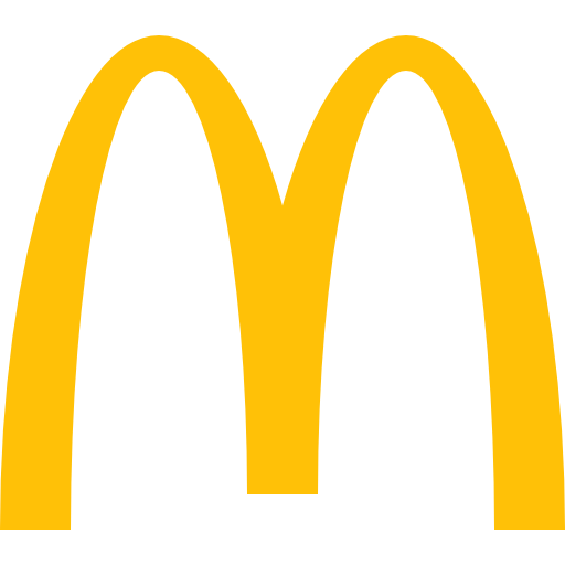
Cost:
The cost of creating the McDonald’s logo is not publicly disclosed, but the logo is worth $106.4 Billion and is in the 9th position of being the most valuable brand.
Meaning:
The golden arches were originally designed to serve a practical purpose as part of the architecture of early McDonald’s restaurants. However, they soon became a symbol of the brand. The golden color of the arches is associates with warmth and friendliness. The logo design is inviting and conveys a sense of familiarity, making customers feel welcome at McDonald’s restaurants.
While there are several brands that originally spent $0 on creating their multi billion dollar company logos, there are also companies that spent thousands of dollars to perfectly create their essence of the brand- the logo. So at the end of the day spending extreme amount of money in creating the logo is not what matters, but it is the service and values the brand provides that makes all the difference in making the brand successful. Logo is not branding, but being able to create such a brand which deliver the best product or service and matches with the ethics and values of the community, makes the logo recognizable as a brand.
Also Read: Buy Now, Pay Later (BNPL) Service in Nepal